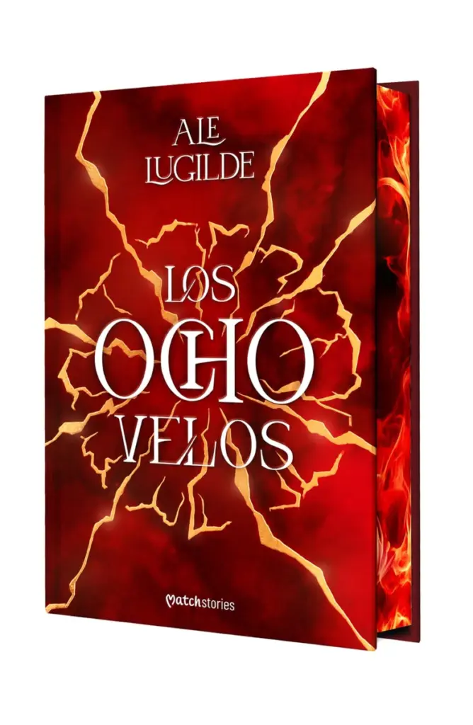
The map of Los Ocho Velos, a black and white fantasy map for Ale Lugilde’s novel, was one of those projects where cartography and editorial illustration have to work hand in hand. The commission came from Esencia, an imprint of Grupo Planeta, with the aim of turning the world of Valcam into an image that could become part of the reading experience itself. You can find the book on Planeta de Libros.
Ale Lugilde, known on social media as Simbeli (@simbeli_), is a Galician content creator with more than half a million followers on Instagram. Funny, warm and hugely imaginative, that ability to invent situations and universes is also behind Valcam.
My job was to turn part of that written world into a black and white fantasy map: to interpret places, hierarchies, distances and narrative elements and transform them into an illustration that looked as if it had always belonged to Valcam.
Black and white fantasy map
The project: depicting the world of Valcam
Creating a map for a fantasy novel is not simply about drawing mountains, forests and cities on a surface. Before starting, you need to understand the role each place plays in the story and, above all, what the reader needs to know at that moment.
In Los Ocho Velos, Valcam had to have its own identity. The map was conceived in black and white and to fill a single page of the book, so a lot of information had to be concentrated without turning the result into something hard to read.
That constraint matters in any black and white fantasy map. When a map is printed inside a novel, space is limited and details have to survive the reduction. A mountain, a city or a small building must still work graphically even when the reader is not looking at an enlarged version on a screen.
It is one of the things I pay most attention to in my map illustration for novels and books. The map has to work as an illustration, but also as a real editorial piece that will be printed at a specific size.
I also wanted the whole piece to feel elegant and to avoid looking like a generic fantasy map. Part of that personality came from the outer decoration and a frame of intertwined thorns, together with visual elements directly related to the world of the novel.

The creative process behind a black and white fantasy map
One of the most interesting parts of working as a map illustrator is that the drawing starts well before you draw.
In this case, Ale gave me a rough map of Valcam as a starting point. It already showed the main locations, the general layout of the territory and some of the elements that had to appear in the final version. My job was not to invent a new geography, but to interpret that sketch and turn it into an illustrated map ready to be part of a novel.
For this black and white fantasy map, I started from that reference and reorganised the information visually, defined the look of cities, villages, forests, mountains and buildings, and set up a hierarchy so readers could understand the territory at a glance without losing the narrative character of the whole.
The brief also included very specific details. Port Fenlow needed a white hermitage; Ashridge needed its mill; Lindhafen had to show an area damaged by fire. There were also shrines, a cabin hidden in the forest and a camp near a lake.
But not everything had to be named. Some places matter precisely because of what they represent in the novel and had to appear on the map without a name. That raises something I find especially interesting: a map for a novel does not have to explain everything.
Revisions until the right visual language appeared
This black and white fantasy map of Valcam evolved during the process. As usually happens in editorial illustration, the first ideas help find the visual direction, and then a dialogue begins between drawing, story, author and publisher.
Some decorative elements planned at first disappeared and others were replaced because they did not convey exactly the tone Los Ocho Velos needed. Symbols, ornaments and small details were revised until everything seemed to belong to the same universe.
For me, these revisions are a natural part of working as an editorial illustrator. When I illustrate for a novel, I do not try to impose an image on the text, but to find the image that book needs.
Black and white: when a limitation becomes a language
Working on a black and white fantasy map has a big influence on how it is built. You cannot use colour to separate territories or create different levels of information. Everything depends on the drawing, the contrast, the density of elements, the empty spaces and the relationship between black and white.
It also forces you to simplify. A forest has to read as a forest without becoming hundreds of identical trees. A mountain range needs volume without dominating the whole composition. Buildings have to be distinguished with very few graphic resources.
That limitation helps achieve something I care about in maps for novels: that the result keeps the feeling of having been drawn specifically for that world. I was not looking for a technical cartography of Valcam, but a piece of narrative illustration.
The map of Valcam beyond the pages of the book
There is another detail of this black and white fantasy map that I find especially interesting. The map has not stayed only inside the printed edition of Los Ocho Velos: Ale has also added it to the official website of the novel, in the section devoted to the cartography and world of Valcam, where the full map can be seen with credit.
That turns the illustration into more than a complement to the pages of the book. The map becomes part of the visual identity of the world created by Ale Lugilde and lets readers return to it outside the novel, explore the territory and connect it with the places they discover as they read.

The value of editorial illustration in books
Editorial illustration can play many roles in a publication. Sometimes it explains; sometimes it creates atmosphere. It can introduce a character, show an important object or help readers grasp the scale of a setting.
Illustrated maps have one more particularity: they help readers mentally organise worlds that exist only in the imagination. This is especially useful in fantasy, but also in science fiction, historical fiction, adventure or any story where journeys and the relationships between places matter.
A good map should not just answer where each place is. It should also show visually what kind of world we are travelling through. That is where the work of an editorial illustrator and that of a conventional cartographer start to diverge: the goal is not only to represent a territory correctly, but to make it consistent with the voice, genre and atmosphere of the book.
Working with an editorial illustrator who specialises in maps
When a publisher or an author needs a map for a novel, a geographic reference is only the starting point. As an illustrator specialising in maps for novels, my job is to turn that information into a visual piece ready to be part of a publication.
That means deciding which information should stand out, simplifying what could create noise, setting visual hierarchies, creating elements unique to the world and adapting the result to the actual printed size. Every project needs a different solution: the map for a dark fantasy novel should not share the visual language of one for a children’s adventure, a historical novel or a science fiction story.
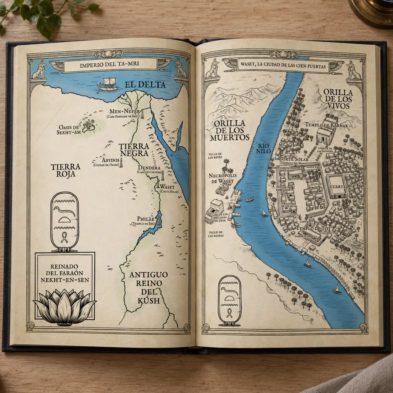
You can see other examples, such as the Bloodwing Academy map for Editorial Planeta and the Ancient Egypt fantasy map for Minotauro.
Frequently asked questions about fantasy maps
What does a map illustrator for a novel do?
A map illustrator interprets the world created by the author and turns it into a visual representation suitable for the book. It is not just about placing locations: it means organising information, setting hierarchies, defining a graphic style and adapting the level of detail to the genre, format and final print size.
Why use a black and white fantasy map?
A black and white fantasy map prints cleanly inside most novels and keeps costs under control. Done well, it can be just as expressive as colour, relying on linework, contrast and composition.
What information does an illustrator need to create a map?
Ideally, an initial sketch with the main locations, geographic relationships and places that matter to the story. It also helps to know the genre, the visual tone, the print size and which elements should be shown or kept hidden to avoid spoilers.
Can a map be created if the author only has a simple sketch?
Yes. A hand-drawn plan, a diagram or even a detailed description can be a starting point. Part of the illustrator’s job is to organise that information into a coherent, legible composition that fits the world of the novel.
A fantasy map that is part of the story
The black and white fantasy map of Los Ocho Velos was designed with a very specific purpose: to let Valcam exist beyond words. The project for Ale Lugilde and Esencia is a good example of what interests me most in editorial illustration: taking an idea created by someone else, understanding its rules and finding a visual way to make it tangible without taking away its mystery.
If you are developing a novel, a book or a publishing project and need an illustrated map or narrative illustration, get in touch and tell me about your project.