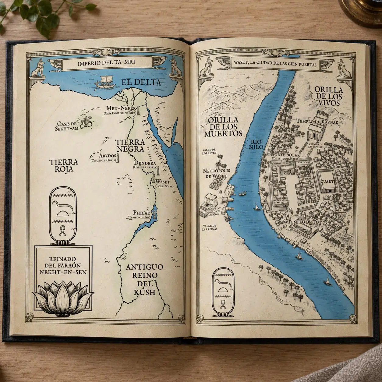
Illustrated maps for novels have a long tradition in fantasy and adventure literature. They help readers find their way around the world of the story, and they add a visual dimension that expands the reading experience.
For the Spanish edition of Sangre de Dragón (Bloodwing Academy 1), published by Editorial Planeta, I worked as an editorial illustrator on several graphic elements for the book: a double-page Bloodwing Academy map, the design of the decorative endpapers and several interior illustrations.
This kind of project is part of the everyday work of a map illustrator for novels, where the illustration has to fit within the book design and help build the visual universe of the story.
Bloodwing Academy map
The commission from Grupo Planeta
The project began when the design team at Editorial Planeta contacted me after seeing some of my work as an editorial illustrator specialising in illustrated maps.
The commission had three main parts:
- An illustrated map of the Bloodwing Academy castle
- The design of the book’s endpapers
- Three small interior illustrations
All of these had to fit into the final book design, respecting the technical limits of printing and staying consistent with the overall look of the novel.

The illustrated Bloodwing Academy map
The main piece of the project was the Bloodwing Academy map: a double-page illustration of the castle where much of the story takes place.
As the illustration was meant to fill two full pages of the book, the composition had to work in a horizontal format and make it easy to identify the different areas of the castle.
To develop the Bloodwing Academy map, we started from the structure of the map in the original edition of the novel, which served as a reference to understand how the castle and its spaces were organised.
However, the editorial team wanted to move away from the artistic style of the original map, which had not fully convinced the editors. The idea was to keep the narrative information of the map but reinterpret it with a different visual style.
From that base, I developed a new composition showing different areas of the academy, including:
- Library
- Classrooms
- Faculty tower
- Dining hall
- Dragon atrium
- Arena
- Drakharrow Tower
- First-year tower
On the Bloodwing Academy map I also added labels with the names of the different spaces, reinforcing the narrative character of the map and making it easier for readers to find their way around the academy while reading.

Technical printing constraints
An interesting aspect of the project was working with specific ink limitations. The Bloodwing Academy map had to be printed using only:
- black ink
- Pantone red
This meant thinking of the Bloodwing Academy map as a very clear graphic piece, where contrast and visual hierarchy had to work with an extremely limited palette. The result is an illustration dominated by red, which reinforces the intense, fantastical atmosphere of the novel.


Designing the book’s endpapers
Besides the map, the project included the design of the endpapers, the pages that connect the cover to the interior of the book. In many editions they are used as a decorative space that extends the visual universe of the work.
Here the design had to meet several technical requirements:
- black line illustration
- no gradients
- prepared for hot foil stamping
The final design was developed as a composition inspired by medieval filigree, with several dragon figures intertwined with plant motifs. The illustration was then used to create a glossy red foil stamp on a black background, a very striking effect in the finished edition.

Interior illustrations
The commission also included three small illustrations for the inside of the book. One of them was the design of Neville, the protagonist’s pet. It had to work at a very small size within the page layout, so I designed it as a simple black line drawing.
The other two illustrations were meant for chapter openings, working as small decorative elements related to the visual world of the castle.

Working as an editorial illustrator for novels
Projects like this are part of the everyday work of an editorial illustrator specialising in books. Editorial illustration requires combining several things:
- narrative interpretation of the story
- adapting to layout requirements
- knowledge of printing processes
- collaboration with editorial teams
With maps for novels, it is also important to find a balance between cartographic clarity and narrative atmosphere. The map has to help readers find their way, but it also has to be part of the visual universe of the story.

Illustrated maps for novels and publishing projects
As an illustrator, I regularly work on projects such as illustrated maps for novels, editorial illustration and book covers, narrative illustration for books and graphic elements for publishing. You can also read about other map projects like The Witcher map or my guide What is an illustrated map.
If you are working on a novel and would like to include an illustrated map or illustrations in your book, get in touch with me to discuss your project.