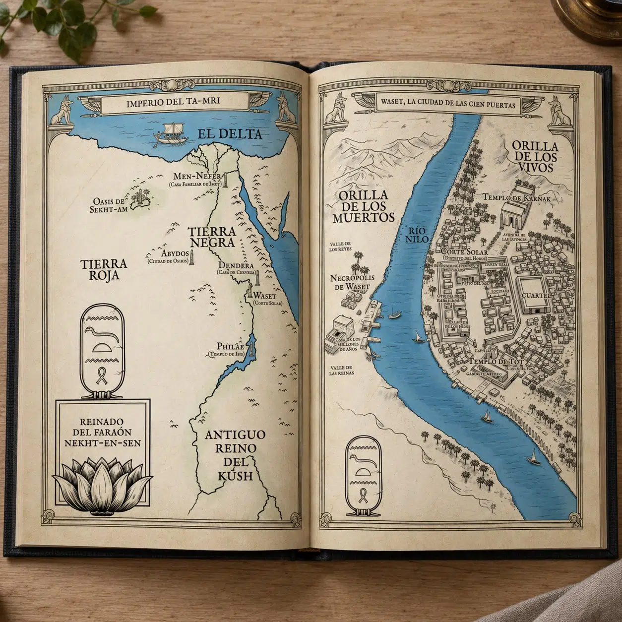
An illustrated map is a hand-drawn representation of a territory, real or imaginary, that combines cartography and illustration to show more than where things are: the atmosphere of the place, its history or the tone of the story. Unlike a geographic map, it does not aim for technical precision; its goal is for the reader to understand, explore and remember that world.
There is a gesture many readers will recognise straight away: opening a new book and, before reading the first line, going straight to the map inside. Looking for it. Studying it. Tracing in your mind the path the characters are about to follow.
Note: this article is an informative guide. If you want to commission an illustrated map for your novel or book, you can see examples of my work and how we can collaborate on my map illustration page.
That gesture says everything about what an illustrated map is.
It is not a technical appendix or decorative filler. It is a promise. It tells the reader: this world is real, it has weight, it has geography, it has history. And if it is well made, you have already entered the story before the first chapter begins.
Illustrated map
It is not a map. It is something else.
A conventional map, like Google Maps or a school atlas, aims for precision: scale, coordinates, exact distances. Its job is to inform. An illustrated map, also known in cartography as a pictorial map, works differently.
An illustrated map has a different job: to create an atmosphere and tell a story. Mountains are not uniform triangles but drawings with shadow and volume. Place names are not set in Arial; they are written in lettering that smells of parchment or fresh ink. Sea creatures peer out from the edges of the ocean because back then nobody knew what lay beyond, and that uncertainty is part of the world.
Geographic accuracy matters, but it is a means, not an end. The end is that when readers look at the map, they feel that the place exists.
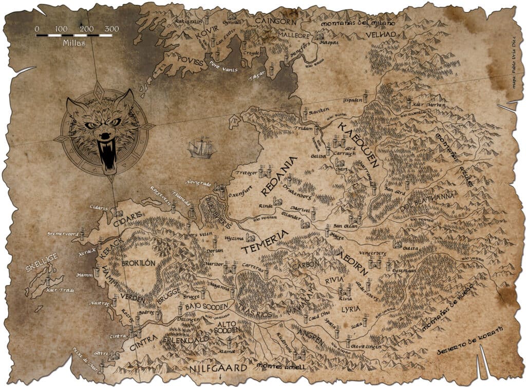
A map for The Witcher: when the geography has to live up to the universe.
What an illustrated map is really for
In a novel
The most obvious function is orientation: in a story with ten kingdoms, three continents and twenty warring factions, the reader needs an anchor. The map does that job without interrupting the narrative.
But there is a less obvious function that may be the most important one: the map builds credibility. When a world has its own cartography, it stops feeling like the author’s invention and starts feeling like a place that existed before anyone wrote about it. Tolkien knew it. George R. R. Martin knows it. Any author who has watched readers study their map for hours understands it perfectly.
Then there is the value of the book as an object. A good map turns a novel into something you want to keep in print even if you own the ebook. That is no small detail for a publisher.
Beyond fiction
Illustrated maps are not only for invented worlds. History books use them so that battles and trade routes make visual sense. Travel books use them to bring itineraries to life. Museums and exhibitions use them because an illustrated map communicates in two seconds what a text would need two paragraphs to explain.

History and geography can live together with great elegance.
The three types of illustrated map most used in publishing
Maps for fantasy novels
These are the most recognisable: imagined kingdoms, continents that do not exist, cities with names that sound like forgotten languages. The visual reference usually comes from the great medieval and Renaissance atlases: detailed linework, every mountain drawn by hand, every forest with its own texture, and the compass rose as an almost heraldic element.
The genre’s references are well known (Tolkien, Martin, Sanderson, Gwynne), but every new world poses its own challenge. How do you draw an archipelago of floating islands? What does a continent look like when it has no northern coast because nobody has ever been there? That is where the illustrator stops being a technician and becomes a co-creator.

Maps for non-fiction books
Historical novels, biographies and essays with a geographic component. Here the challenge is different: the data has to be correct, but the map also has to fit the design of the book. A mistake in scale or a geographic anachronism can destroy the credibility of the whole work.
The illustrator works closely with the book designer and often with the author to make sure the map is not only beautiful but accurate wherever it needs to be.
Historical and geographic maps
Reinterpreting the cartography of other eras through modern eyes. That means researching how maps were drawn in the fifteenth century, which conventions were used, what people knew and what they ignored, and then translating all of that into a piece that works in a modern book.
A map of the Silk Road, of the Roman Empire at its greatest extent or of the Renaissance voyages of exploration can be as narrative and evocative as the best fantasy map, with the difference that every border, name and route has to be justified.

How an illustrated map is really made
The question authors ask most often when they consider commissioning a map is: where do we start?
The answer is always the same: with the territory in words. You do not need a sketch or any knowledge of cartography. What you need is to know what is in your world: which important cities exist, which geographic features define the landscape, which distances matter to the plot and which visual tone suits your story.
From there, the process has its own rhythm. First, a structural sketch, so that the geography works and the composition is balanced. Then the style: medieval, contemporary, minimalist, highly detailed? Colour or black and white? With a decorative border or clean? Next comes the full illustration, which in digital is built in layers so it can be adjusted without losing work. Finally, delivery in the formats you need: high resolution for print, an optimised version for the web, or both.
The total time depends on the complexity, but a complete editorial map usually takes between two and four weeks of real work.
What separates a good illustrated map from a mediocre one
Two things, and they are inseparable: it has to be beautiful and it has to be legible. A gorgeous map that cannot be read when printed at A5 size is a failed map. A perfectly legible map that looks like it came out of a slideshow does not do the job either.
The best illustrated maps have one thing in common: every element is where it is for a reason. Ornamental detail enriches; unnecessary detail distracts. And lettering, the element that is most often neglected, is as much a part of the map as the mountains.
If you have a world, it deserves an illustrated map
If you are writing a novel, preparing a special edition or working on a publishing project that needs an illustrated map, the first step is always to talk to someone who understands both sides of the job: the artistic and the editorial.
You can see my full portfolio of illustrated maps, for fantasy sagas, publishing projects and historical commissions, as well as case studies such as the Tigana maps and the Shadowmarch maps.
And if you have a specific project in mind, you can write to me directly to talk about what you need. No strange forms, no automatic quotes. Just a conversation about your world.